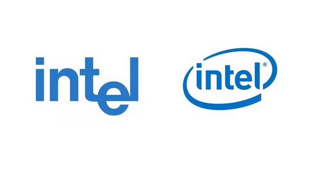
According to Karen Walker, the senior VP and Chief Marketing Officer of the company, the new logo is inspired by Intel co-founder, Robert Noyce’s quote: “Don’t be encumbered by history. Go off and do something wonderful”. It reflects the company’s role in creating ‘world-changing technology’, she said. Left: Original Logo from 1968; Right: Outgoing Logo, Introduced in 2006 While a lot has changed about the logo, the one thing that Intel is retaining is the five-note ‘bong’ in its video ads. According to Ms. Walker, the company’s musical sound signature will retain those iconic five notes, but a modernized version will roll out later this year. Intel is also retaining blue as the foundational color of the brand, but with the new logo, the company is introducing new shades of the color in addition to the classic hue. According to the company, the extended color palette will add more depth to the logo and modernize its visual identity.
All said and done, Walker says she knows that a new brand won’t simply come to life with new colors, sounds and logo. Instead, “it needs to be a unifying rally cry built on action and aligned with our company purpose. We recognize that only through time and a continued track record for excellence in innovation and delivering for our customers will we shape and define ourselves”. You can check out Intel’s new brand identity in the video above. Featured Image Courtesy: Intel
